Most sports fans think they know their favorite team’s logo by heart. Then someone points out a hidden letter, a secret symbol, or a design detail that somehow stayed invisible for years — and suddenly your brain refuses to see anything else.
That is exactly why sports logos with hidden meanings have become such a huge obsession online. Fans love discovering details that somehow stayed unnoticed for years, especially when the hidden meaning completely changes the way a logo looks.
The craziest part is that many of these details were sitting in plain sight the whole time. Once you notice them, there is no going back.
7 sports logos with hidden meanings
At first glance, these logos look completely normal. Look a little closer, though, and some of them start looking very different.
Milwaukee Brewers
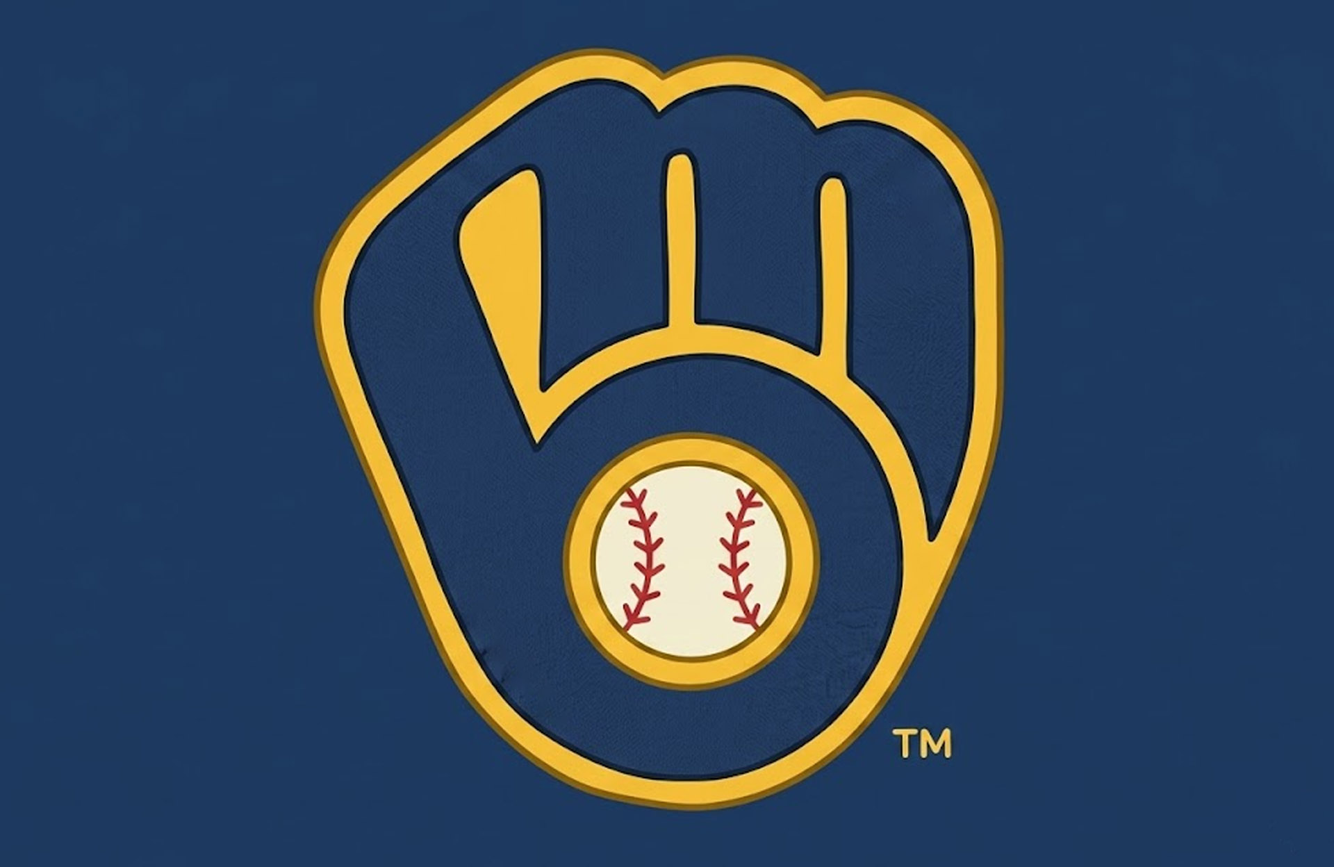
At first glance, the Milwaukee Brewers logo looks like a regular baseball glove. Simple enough, right?
Not even close.
The glove secretly forms the lowercase letters “m” and “b” for Milwaukee Brewers. The “m” creates the left side of the glove, while the “b” shapes the pocket on the right side.
A shocking number of baseball fans never notice it until somebody points it out online. Then comes the classic reaction: staring at the logo for 10 seconds in complete disbelief.
What makes the design brilliant is how natural it feels. The hidden initials do not look forced or gimmicky. Everything blends together perfectly, which is why this logo is constantly mentioned whenever fans debate the best sports logos with hidden meanings.
Honestly, this logo deserves its own Hall of Fame plaque.
Minnesota Wild
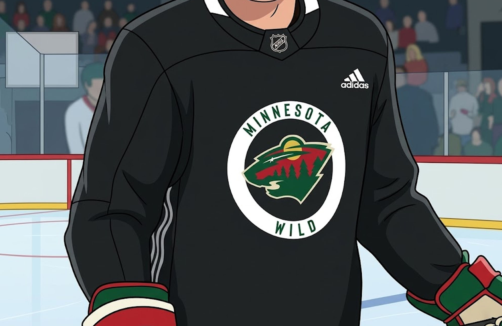
The Minnesota Wild logo might be one of the most creative designs in professional sports.
Most people only see an angry animal face at first. But the logo is actually an entire outdoor scene packed into one image.
The eye doubles as the North Star, a reference to Minnesota’s hockey history. The sweeping line across the middle represents the Mississippi River. The green areas resemble forests, while the red and orange colors look like a sunset over nature.
It is basically an entire state hidden inside a bear-shaped puzzle.
The logo works because every detail connects back to Minnesota without feeling overcrowded. Some sports logos try way too hard to include everything. This one somehow pulls it off without becoming a complete mess.
Washington Capitals
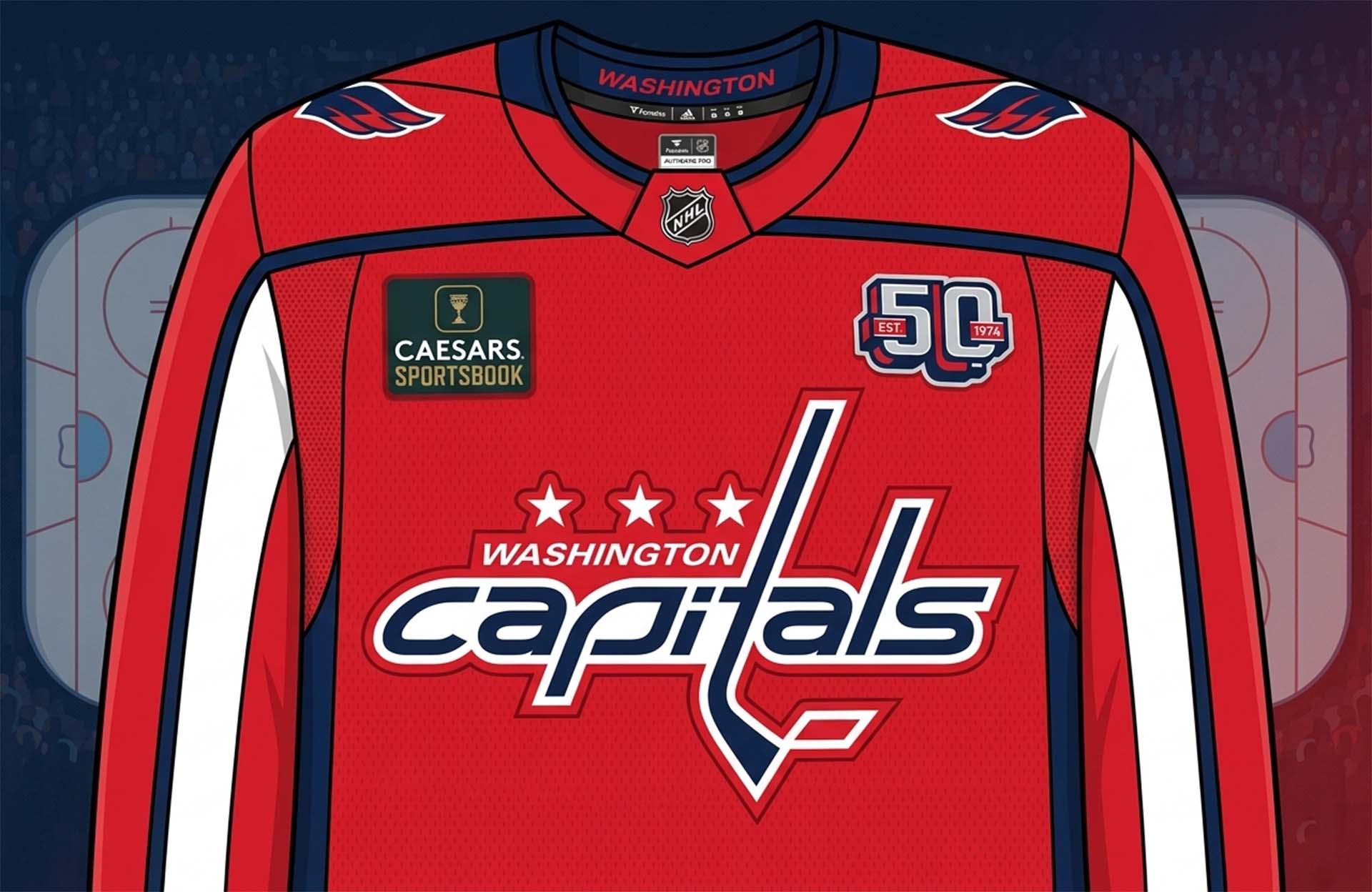
The Washington Capitals’ secondary logo hides a detail that many hockey fans miss for years.
If you look closely at the lower part of the eagle, the curve forms the shape of the U.S. Capitol building dome.
It is one of those design choices that feels incredibly obvious once you notice it. Before that moment, though, most people just see a cool eagle logo and move on with their lives.
The hidden architectural detail gives the logo a strong connection to Washington, D.C., but in a subtle way. Instead of slapping a giant flag onto the design, the team worked the city’s identity naturally into the artwork.
That restraint is probably why the logo still looks modern today and why it often appears in conversations about sports logos with hidden meanings.
Pittsburgh Steelers
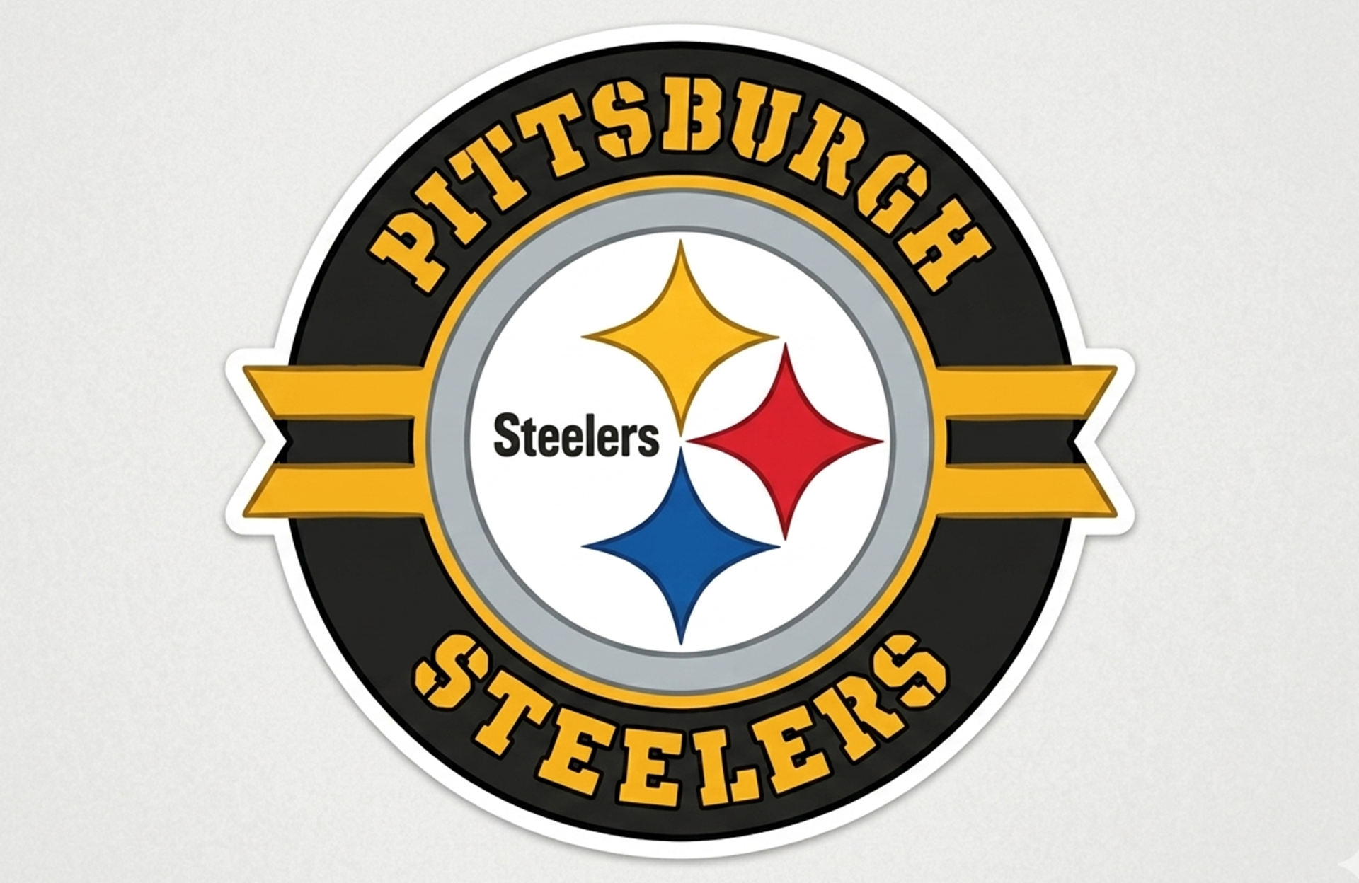
The Pittsburgh Steelers logo is filled with industrial history that connects directly to the city itself.
The three colored diamond-like shapes are called hypocycloids. Yellow represents coal, orange stands for iron ore, and blue symbolizes steel scrap — the raw materials used to make steel.
The design originally came from the American Iron and Steel Institute before the Steelers adopted it in the 1960s. In other words, the team literally borrowed part of the steel industry’s identity and turned it into football history.
There is also another detail casual fans often miss: the Steelers logo only appears on one side of the helmet.
At first, the team tested the look because they were unsure if the logo would even work on helmets. Then everybody loved the asymmetrical style, so they kept it. Now it is one of the most recognizable looks in sports.
Sometimes accidents create the best traditions.
Hartford Whalers
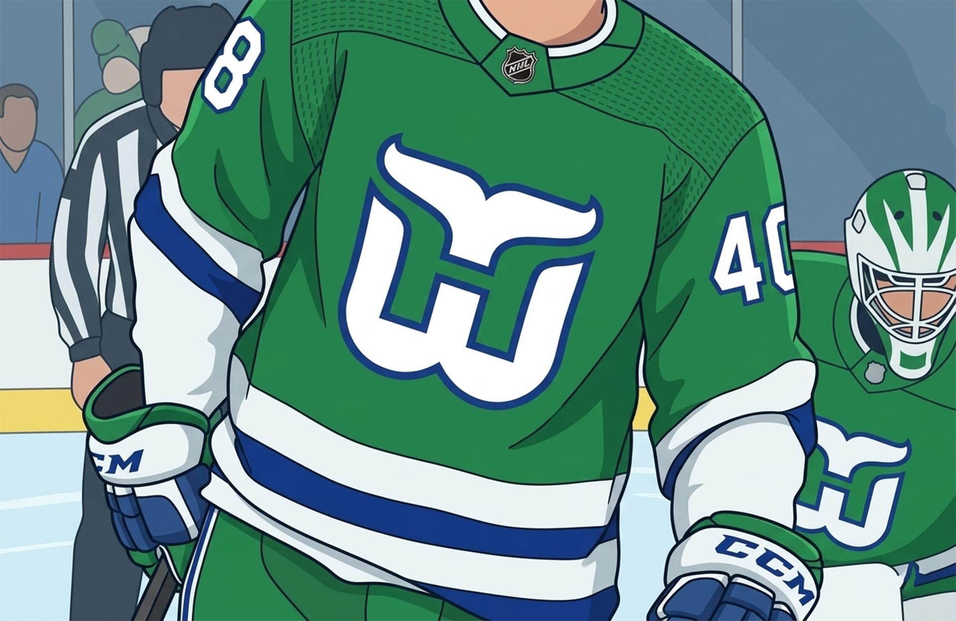
Even though the Hartford Whalers no longer exist, their logo still gets praised as one of the smartest designs in sports history.
Most fans immediately notice the green “W” and the whale tail at the top. But hidden in the middle is a white “H” for Hartford.
Once somebody shows you the hidden letter, your brain instantly switches modes and suddenly it is impossible not to see it.
That is usually the sign of an elite logo design.
The Whalers logo became legendary because it uses negative space perfectly. Nothing feels forced. The hidden “H” quietly sits there waiting for fans to discover it years later.
Not bad for a logo older than a lot of current NHL players.
Atlanta Falcons
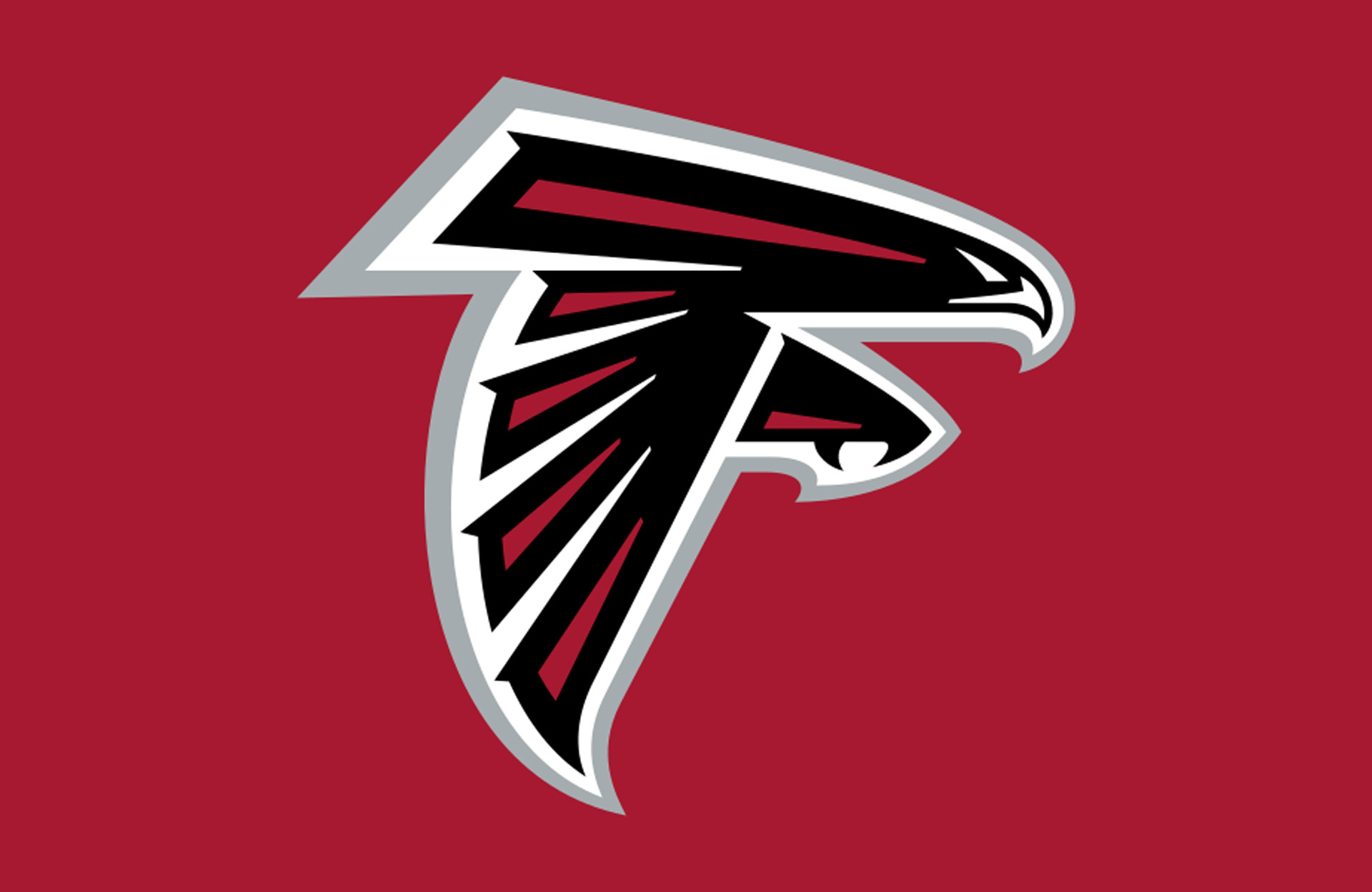
The Atlanta Falcons logo hides a simple detail that many NFL fans overlook completely.
The falcon itself is shaped like the letter “F.”
Now go look at it again. You probably cannot unsee it anymore.
The sharp angles and aggressive design make the logo feel fast and powerful while still keeping the team identity clear. It is a great example of how hidden meanings do not always need to be complicated.
Sometimes the smartest designs are the simplest ones, which is exactly why fans love discovering sports logos with hidden meanings years after first seeing them.
Chicago Bulls
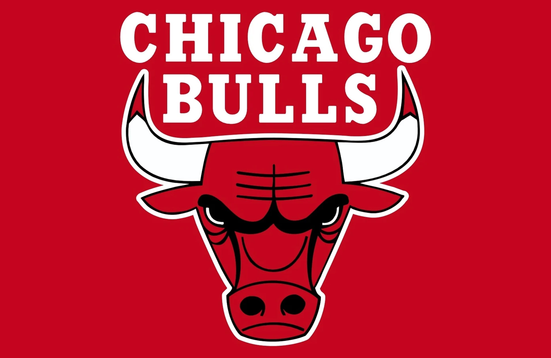
The Chicago Bulls logo became famous online for one extremely weird reason.
If you flip the logo upside down, it strangely looks like a robot reading a book while sitting on a bench.
No, seriously.
The internet discovered the accidental image years ago, and now thousands of basketball fans can no longer look at the logo normally. The hidden robot was obviously never intentional, but it became one of the funniest sports logo discoveries ever shared online.
Poor Bulls fans probably just wanted to enjoy basketball without seeing robotic library time every game.
As you can see, sports fans are apparently great at memorizing stats and arguing online — but not always great at noticing what is right in front of them.
Some of these logos fooled millions of people for years before somebody finally pointed them out online.
And honestly, there are probably still a few famous sports logos hiding something fans have not noticed yet.